The Meaning Behind Our New Logo
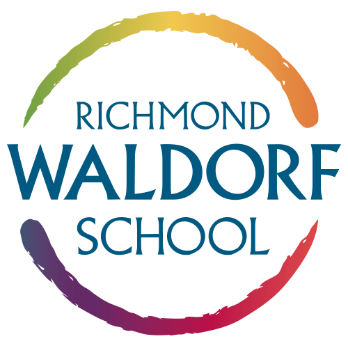
The circle represents wholeness in body, soul, and spirit.
The color blue symbolizes trust, freedom, balance, and peace.
The prismatic colors create a rhythmic flow and feeling of movement, are welcoming, and are symbolic of inclusivity.
The energy of the circle moves clockwise to represent the rhythms within Waldorf culture (daily, weekly, seasonally, yearly, developmentally) and the continuous flow of learning and development within our teachers and students.
The prismatic order of colors moves counter-clockwise, symbolizing how Waldorf education is very different from mainstream education.
The open circle creates two opposite forces, which are actually complementary and interdependent of each other. These dualities are seen throughout nature and everyday life (light/dark, in breath/out breath, summer/winter).
The design has a feel of something created by hand, while the letters are crisp and modern with unique angles.
The word Waldorf extends beyond the circle in a sense of freedom. This same freedom is at the heart of what we want for our students-that a Waldorf education prepares them and allows them freedom (intellect, spirit, community).

